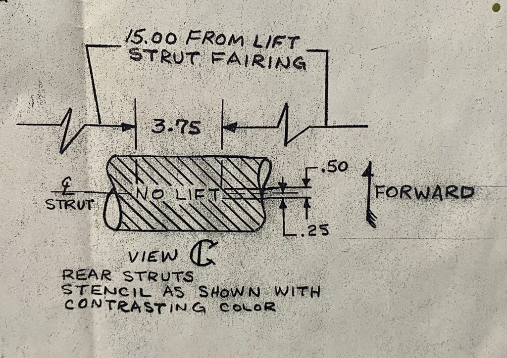
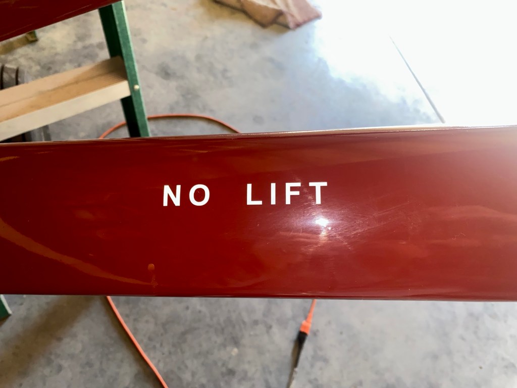
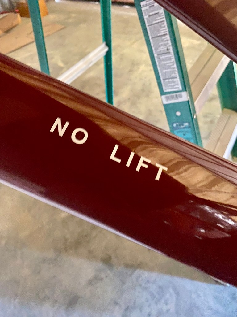
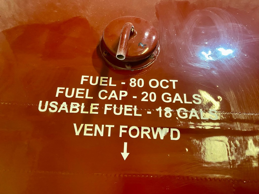
I used flat white for the ‘contrasting color’ called out for on the drawing. Diana Creme would have worked but I’m all out and I didn’t want to spend $200 just to do these in that color. White looks fine.
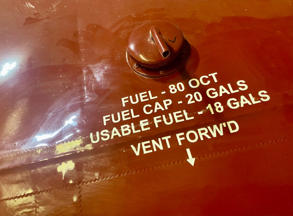

I used flat white for the ‘contrasting color’ called out for on the drawing. Diana Creme would have worked but I’m all out and I didn’t want to spend $200 just to do these in that color. White looks fine.

looks very nice
LikeLike
How’s this work?
LikeLike
Do you know how I can change my ema
LikeLike
Text me what email you want and I’ll change it on my end.
LikeLike